What are Data Visualization Best Practices?
Summarize this article with:
✨ AI Generated Summary
Data visualization is essential for making complex data understandable and aiding decision-making across various teams. Key best practices include:
- Using concise, well-placed text and consistent, minimal visuals to enhance clarity.
- Selecting appropriate chart types (line, bar, area, column) based on data and ensuring predictable, logical layouts.
- Incorporating interactive features for deeper insights while avoiding distractions.
- Leveraging powerful tools like Tableau, Jupyter, Google Charts, and Airbyte for automation and integration.
- Continuously iterating visualizations based on feedback and new data to improve relevance and impact.
In a competitive landscape, it is very important to have accessible ways to view and understand data. That's why data visualization plays a crucial role in decision-making. Your choices in the data visualization process are not all about the aesthetics, designs, and how it looks. Each decision is crucial to the message you want to convey. Therefore, effectively learning to visualize data is key to optimizing business operations.
And that's what we are focusing on in this article. Here, you'll learn best practices for data visualization to showcase your intentions with the data efficiently.
What is Data Visualization?

Data visualization converts information into a visual context, such as a graph or map, to make the data easier to convey and make humans understand. Data visualization aims to streamline the task of identifying patterns and trends and pull insights from a large set of data. It is one of the crucial steps in the data science process, which states that after data is collected, processed, and modeled, it must be visualized for making business decisions.
However, data visualization can be used for various purposes, not just for data teams. Management, stakeholders, marketing, and other non-technical teams leverage it to convey organizational structure and hierarchy of data.
Best Practices For Data Visualization
Before diving into the best practices, you must figure out some of the basic principles for data visualization. You should know what, why, and for whom you design the visuals. Once that is figured out, you can follow the best practices mentioned below to make data visualization more effective:
Use Texts Carefully
Most professionals assume using texts isn't a good idea in data visualization, and applying as many visuals as possible is the way to go. That's not the case. Text is a crucial component of data visualization that can help you tell a story. However, the choice and placement of text can make a lot of difference in improving your data visualization. Below are some of the guidelines that can help your visualization to be from good to great:
- Avoid using too much text, as it can get distracting. Instead, convey your message using brief and clear labels, titles, and annotations.
- Put all the vital points in the text in the top or upper left corner because the human eye is naturally drawn to that place first.
- Select styles and fonts that are easy to read. It should also complement the overall design of visualization.
- Use colors and formatting to make a point in visualization. However, avoid using too many colors and styles and be consistent with your visualization.
Choosing the Right Visuals
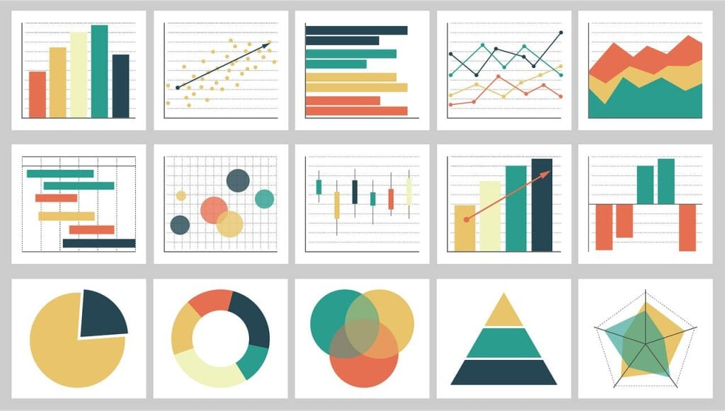
The right type of visuals expresses the information included in the data in a much more efficient way. Here are some of the most popular types of charts that you can use according to the data you want to present:
- Line Chart: A line chart connects a series of data points using a line. These charts present sequential values to help you identify trends in business operations. These charts can be used for displaying large and small changes in data.
- Bar Chart: The bar chart displays different categories of data with rectangular bars where the height or length corresponds to the value of each data point. You can use these charts to compare quantitative data from several categories.
- Area Chart: An area chart is a graph combining a line and a bar chart. You can use these charts to show how values and data points develop over time.
- Column Chart: A column chart shows categories in vertical columns. The height of each category is proportionate to the values plotted. It is used when you want to compare many categories with subcategories.
Use Predictable Patterns For Layout
Human eyes are drawn to indicators that tell important information at a glance. You might have observed that we seek patterns in visuals, and if the patterns are difficult to understand, they become difficult to understand.
Therefore, capitalizing on this behavior, you should ensure the order or format of presenting the data makes sense to the viewers, whether alphabetical, numeric, or sequential. Below are some of the strategies that can allow you to implement data visualization effectively:
- Consistency: In layout designs, consistency helps viewers navigate complex datasets. By implementing simple patterns such as aligning elements along the grid or arranging them hierarchically, you provide the viewers with familiar visuals that guide attention.
- Minimize Visuals: Many visuals can overwhelm viewers and take attention to detail. If you apply minimal and basic visuals, you can reduce cognitive load and make information more easy to process.
- Leverage White Space: White space provides a breathing room to help users distinguish between elements. You can use the space intentionally to create a sense of balance and hierarchy that enhances comprehension and readability.
Provide Interactive Features
Data visualization is all about details, and interactive features allow you to showcase them. Adding features such as filtering, zooming, or drill-down capabilities enables the viewers to explore information in a detailed way. It empowers them to interact dynamically with the data to reach the conclusion you want to convey from the visuals to uncover insights.
Some of the advantages of this best practice are as follows:
- Dynamic Interaction: Viewers can actively engage with visuals to understand better, whether it's toggling between different views, adjusting parameters, or exploring alternative scenarios.
- Deeper Insights: Interactive features enable your audience to uncover hidden patterns, relationships, and trends that may not be obvious in a static view.
- Improved Decision Making: With these features, you can explore and analyze the data in a specific way that supports the optimization of business decisions.
However, apart from advantages, interactive features can also become a distraction, so you must ensure they enhance the overall experience rather than distract the viewers.
Use Data Visualization Tools
Manual data visualization can only take you so far. Automating the visualization creation process requires organizations to use huge, complex data sets. Here are some of the best data visualization tools available:
- Tableau: Tableau is a data visualization tool to automate data visualization and get clear opinions based on data analysis. The tool has many data sources to import data for visualization practices, including CSV files and Google Ads. With Tableau, designers can create color-code maps that showcase geographically important data in a much easier-to-understand format.
- Jupyter: Jupyter is a web application for data visualization that enables you to create and share documents containing equations, visuals, live code, and narrative text. It is ideal for data transformation, cleansing, numerical simulation, statistical modeling, visualizations, and machine learning.
- Google Charts: Provided by Google, Google Charts is one of the leading data visualization tools in the market. The tool is coded with SVG and HTML5 and is known for its capability to produce pictorial and graphical data visualizations.
However, moving data from one place to another can be complex if you want to use any data visualization tool. That's where tools like Airbyte can help you out.

Airbyte is a data integration platform that follows an ELT approach to integrate data from multiple sources to the destination. It has the largest catalog of pre-built connectors that number over 350+ to connect any source to a destination of your choice. If you still can't find the desired pre-built connectors, Airbyte provides a connector development kit to build a custom one.
Beyond connectors, the tool offers many capabilities, including an intuitive user interface and scheduling and monitoring capabilities.
Over 40,000+ engineers use Airbyte for data replication purposes. Join its vibrant community and sign up or log in to Airbyte today.
Continuously Iterate and Improve
Data visualization is a continuous process, and continually striving for improvements is crucial. Therefore, update the visualization accordingly as the new data becomes available or you gain new insights. Data visualization begins by clearly understanding the audience and the purpose, selecting required visuals, and simplifying the design for easy comprehension. In the whole process, you should look at the tasks repetitively to refine the visual representation for clarity, relevance, and impact.
In addition, looking for feedback and staying updated with the latest trends ensures ongoing improvement that allows data visualizations to evolve dynamically.
Conclusion
Good data visualization should communicate the information you want to convey clearly by effectively using graphics. The best visuals make it easy to comprehend data at a glance. They take complicated information and break it down in such a way that makes it easy for professionals and target audiences to understand the data on which to base business decisions. Therefore, knowing the effective ways to perform this task can help you greatly.
By following the best practices mentioned above, you can harness the full potential of data visualization.

