14 Best Big Data Visualization Tools for 2026
Summarize this article with:
Data has become an organization's valuable asset as it helps businesses draw data-driven insights and observe trends to optimize workflow. However, with an unprecedented amount of data, it is essential to visualize data clearly and concisely. This is where the role of big data visualization tools comes into the picture. It equips your organization with transformative tools to visualize complex data effortlessly.
This article will delve deeper into different big data analytics visualization tools you can employ for day-to-day business activities. These tools come with various features to cater to your specific business requirements. So, without further delay, let’s get started.
Overview of Data Visualization
Data visualization represents data sets and information in a graphical format, leveraging visual analytics to create graphs, charts, dashboards, and other formats. It facilitates the effortless transformation of complex statistics and time series data into easily understandable visuals through tools like Highcharts and Google Charts, which can render everything from basic infographics to sophisticated vector graphics. You can use these visualizations to discover patterns, identify trends, and derive actionable insights from a dataset. In other words, it adds depth to your decision-making process by presenting data in a structured and visually appealing manner.
Top 14 Tools for Big Data Visualization
Now that you have understood the importance of data visualization, you should familiarize yourself with the big data tools to unlock the power of your dataset.
1. Power BI
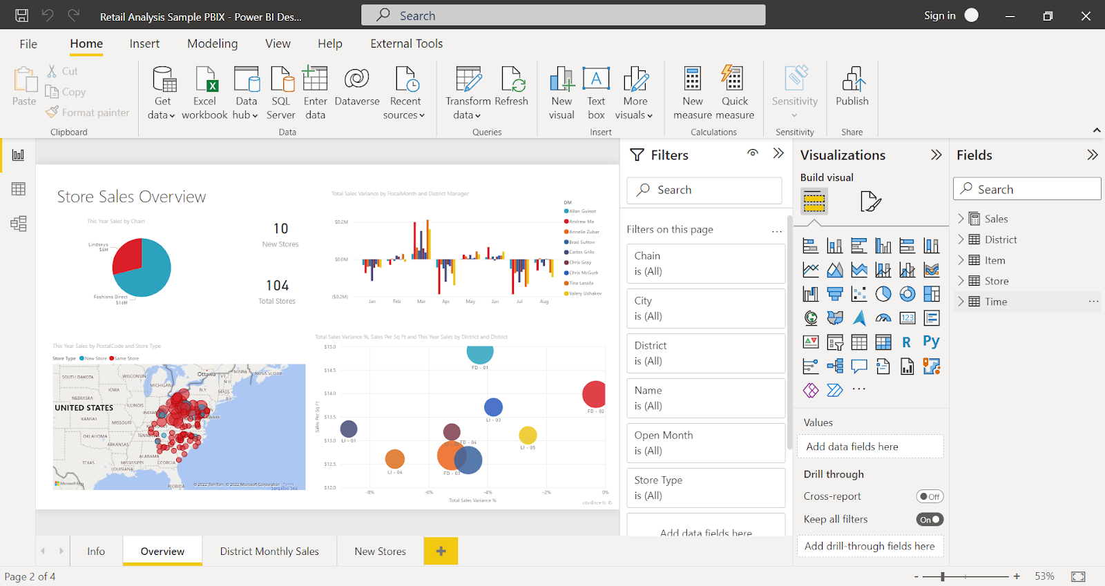
Developed by Microsoft, Power BI is a software application that enables you to transform disparate data sources into cohesive, interactive, and captivating insights. Power BI, available as a Software as a service (SaaS), offers robust data modeling capabilities and visualization avenues, ranging from pivot tables to complex illustrations powered by programming languages like Python with NumPy and Matplotlib. For instance, you can gain comprehensive knowledge of significant KPIs by connecting to data sources like Google Analytics, Symbolab and BigQuery, enabling deep data exploration through SELECT(SQL) queries.
Key Features:
- Data Connectivity: It provides various options for connecting to different data sources, including Excel spreadsheets, cloud-based databases, and on-premises data.
- User Friendly: With a wide range of functions from simple data modeling to complex analytics, the Power BI tool is tailored to benefit experienced and novice users.
- Data Transformation with Power Query: Power Query is a powerful tool for performing ETL data processing. It has a power query editor interface to import data from multiple sources to perform transformations such as filtering rows and columns. You can also perform advanced transformations like pivoting, grouping, and text manipulation.
- Updates Data Automatically: You may eliminate time-consuming manual report updates using Power BI’s scheduled refresh feature. It helps to automate your data pipelines by defining the frequency and time slots to refresh the data. Although the aim is to refresh your data within 15 minutes of the scheduled time, in rare cases, you can expect a delay of up to one hour.
2. Tableau
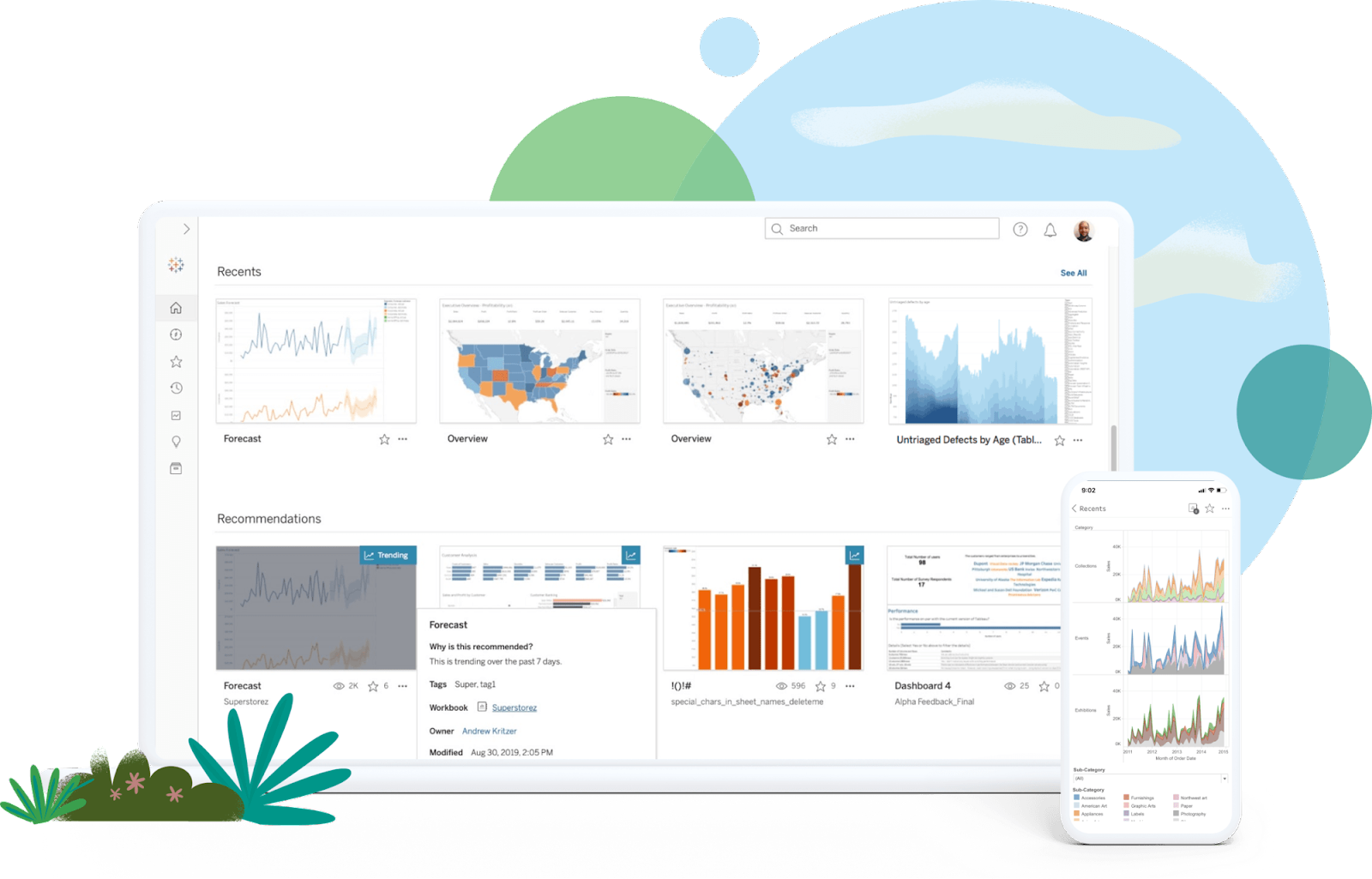
Tableau is an incredible business intelligence and data visualization application for reporting and assessing large volumes of data. It helps you to create charts, graphs, maps, and dashboards to display and analyze data effectively.
Key Features:
- Dynamic Dashboards: Tableau allows you to construct visuals that include drill-down capabilities, visual isolation of specific data subsets, data order modification, and many other features.
- Enhanced Data Reliability: Tableau Catalog automatically catalogs all your data sources and assets for quick discovery. It also offers metadata within Tableau to help you understand and trust the data you consume.
- Data Exploration: Defining relationships in your data can be tedious, but the Explain Data feature simplifies this process. You can swiftly delve deeper into the datasets to discover essential data points.
3. Qlik Sense
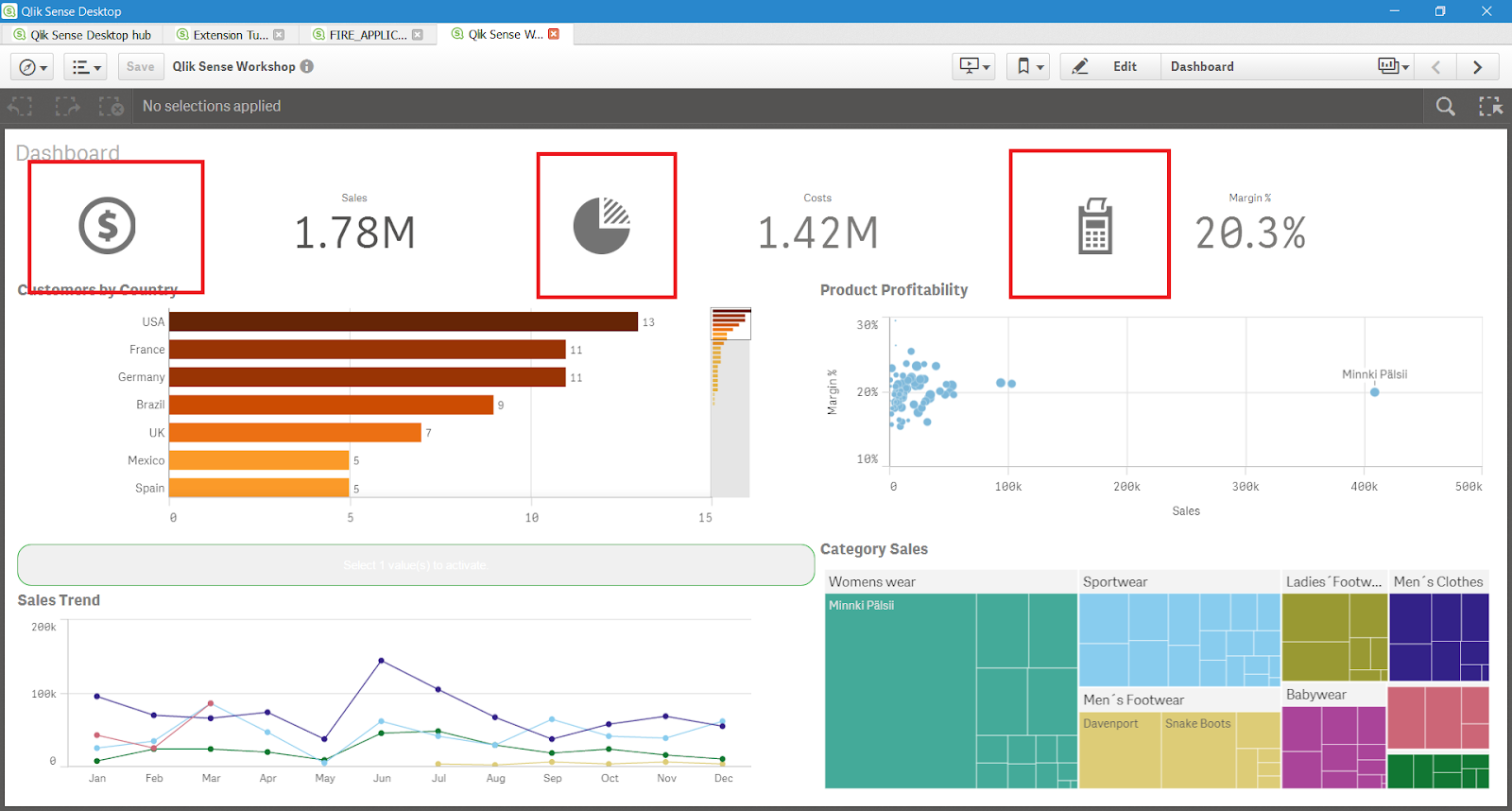
Qlik Sense is a popular analytics platform because of its in-memory data processing, which makes data manipulation and analysis faster. The application allows data visualization from several sources and encourages in-depth analysis, making creating solid and intuitive data visualizations easier. With a user-friendly interface, Qlik Sense promotes self-service data recovery by empowering you to design your dashboards and reports for analysis.
Key Features:
- Augmented Data Analysis: Qlik Sense has a wide range of capabilities for augmented data analytics. This feature lets you combine human and artificial intelligence to make simple and visual interactions with data. You can ask queries regarding data, and it will automatically generate insights by analyzing the data.
- Alerting and Automation: Qlik has an alerting feature that helps you monitor your datasets. You can instantly respond to the changes made in your data and keep track of them. Moreover, you can also automate your routine tasks and synchronize your key tools to work with analytics.
- Customized Applications and Add-ons: Qlik Sense includes various add-ons like Qlik.dev, which integrates Qlik with custom business applications, API references, and developer documentation. Additionally, you can incorporate plug-ins like Visual Basic and employ server-side, write-back, and visualization extensions for analysis within the Qlik Sense application.
4. Sisense
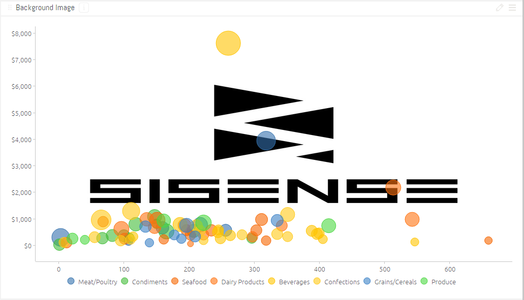
Sisense is a highly intuitive and adaptable data visualization tool that facilitates seamless data exploration, consolidation, analysis, and visualization. Using interactive dashboards powered by tools like Highcharts and Google Charts, it helps you turn complicated time series data and statistics into significant insights. The platform's exploration capabilities allow users to drill down into data sets through visual analytics, creating a natural flow from raw data to actionable intelligence that can be shared or embedded anywhere. Sisense aims to assist you in making well-informed decisions by offering a straightforward interface for reporting and data research.
Key Features:
- High Scalability: Sisense is easily scalable to meet your expanding needs and data quantities. Whether your company is a small corporation or a large enterprise, it is built to reshape according to requirements.
- AI and Machine Learning Capabilities: Sisense facilitates data forecasting and predictive analytics to help you anticipate future market trends and make farsighted decisions using the potential of AI and machine learning tools.
- Enhanced Data Security: Sisense has many data security and governance features to ensure your data is protected and consistent with relevant regulations. It uses various encryption technologies like SHA-256 and TripleDES to secure account credentials and authorization.
5. Zoho Analytics
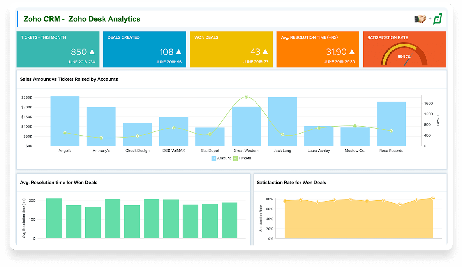
Zoho Analytics is a data reporting and visualization application that makes it simple to create engaging dashboards. You can track essential performance indicators, spot anomalies, anticipate the future, and identify undiscovered insights using the analytics system.
Key Features:
- Unified Business Insights: By combining data from several teams, like sales, marketing, finance, and support, Zoho Analytics enables you to unify your business data. It also provides easy connectivity, pre-built analytics, and smart data integration capabilities for a smooth study of the unified data with distinctive end-to-end insights.
- Data Security: Zoho Analytics offers security practices, which include continuous support for regular data backups, data confidentiality, design privacy, and a clear separation of roles in the workspace.
- Easy Deployment: It provides alternatives for deployment on public clouds such as Azure, AWS, and Google, in addition to its cloud-based analytics software subscriptions.
6. Looker

Provided by Google, Looker is an integrated self-service analytics platform that lets you build reports from several data sources and optimize workflows. It is a multi-cloud unified platform offering data visualization for on-premise databases like MariaDB and PostgreSQL and cloud-based platforms like Azure.
Key Features:
- Intuitive User Interface: It is very convenient to set up and use Looker as it allows you to build custom data models and draft reports. It offers dashboards with customized charts, graphs, and reports that display data and insights.
- AI-Powered: Looker has enhanced its data visualization skills by tapping the power of DuetAI. It brings an intelligent analyst to assist your organization’s data in creating advanced visualizations within a few sentences of instruction. Moreover, it also utilizes natural language to create formulas.
- Extensive Collaboration: Looker has many third-party network ecosystems to strengthen your extensive data visualization process. You can embed data from Looker’s BI software with tools such as Confluence, Salesforce, and PowerPoint.
7. Kibana
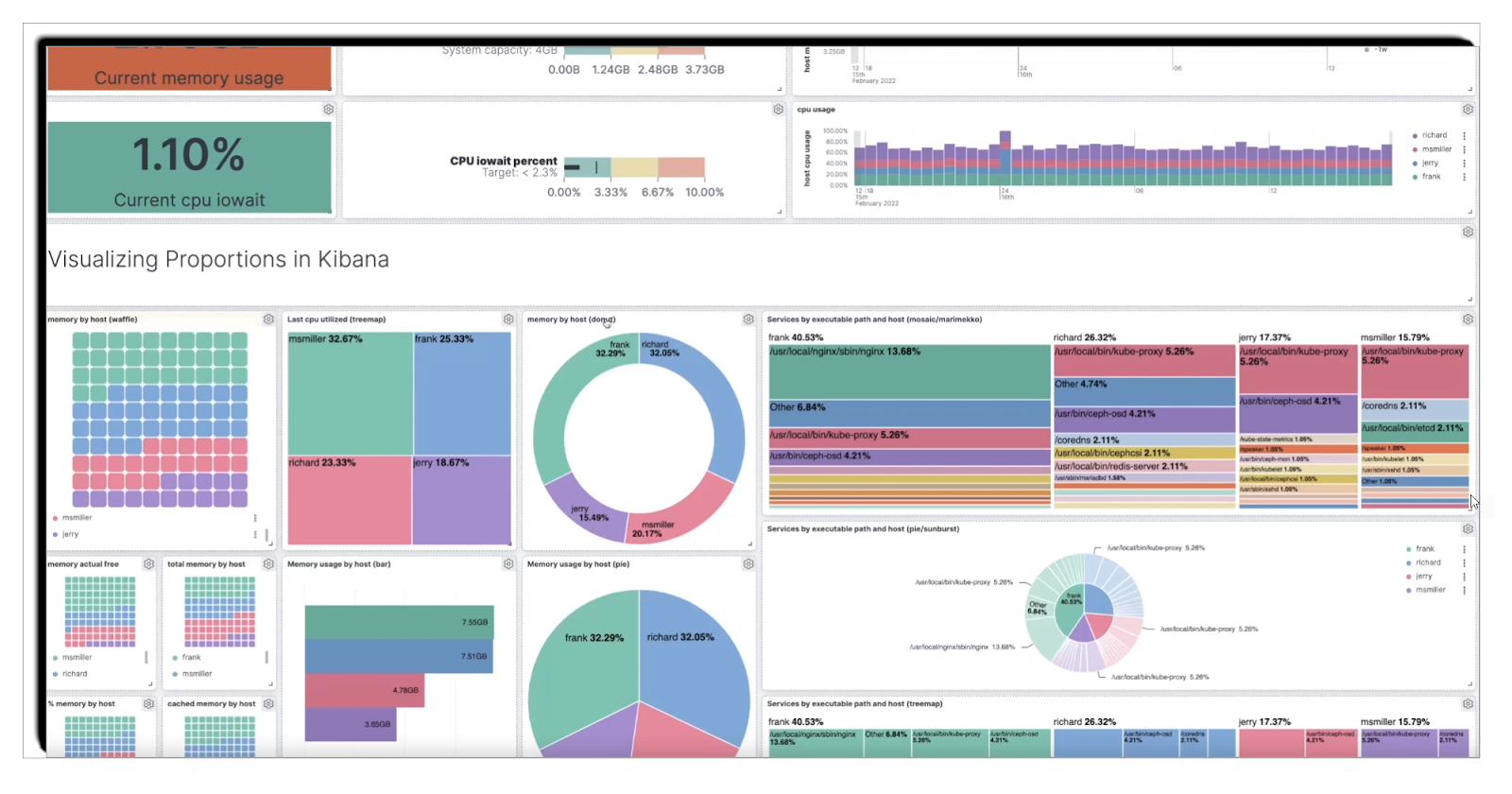
Kibana is a data visualization and exploration tool that was developed by Elastic and is used to convert data from Elasticsearch into visual form. Kibana offers a wide range of data visualization tools and flexible query features that make it easier to work with big data. For instance, you can track system performance, user activity, and other key metrics that will help management make decisions and create strategies for the future.
Key Features:
- Data Visualization: Kibana provides a broad number of options for visualizations, including the basic bar and line charts and the more advanced heat maps and pie charts. These types of visualizations are useful in that they allow users to easily comprehend patterns and trends in their data.
- Elasticsearch Integration: It is designed to work with Elasticsearch, and users can use it to query, analyze, and visualize data in Elasticsearch indices. This close coupling allows for real-time processing and visualization of big data.
- Dashboard Creation: Kibana has the ability to create and share dashboards that are unique to the user. These dashboards can contain several visualizations on a single page, which makes them a convenient tool for data analysis. Dashboards can be customized to the requirements of a certain business, which allows for the tracking of important parameters and indicators.
- Data Exploration with Kibana Lens: Kibana Lens is a feature that can be used to analyze and visualize data. It offers a simple drag-and-drop feature for designing the visualizations, which allows users to interact with their data and find patterns without extensive programming knowledge.
- Alerts and Notifications: Kibana can set up alerts and notifications depending on the condition or the threshold set. These alerts can be set to inform users when specific events happen or when data is in a specific range or value, thus allowing for timely action on critical events.
8. Plotly
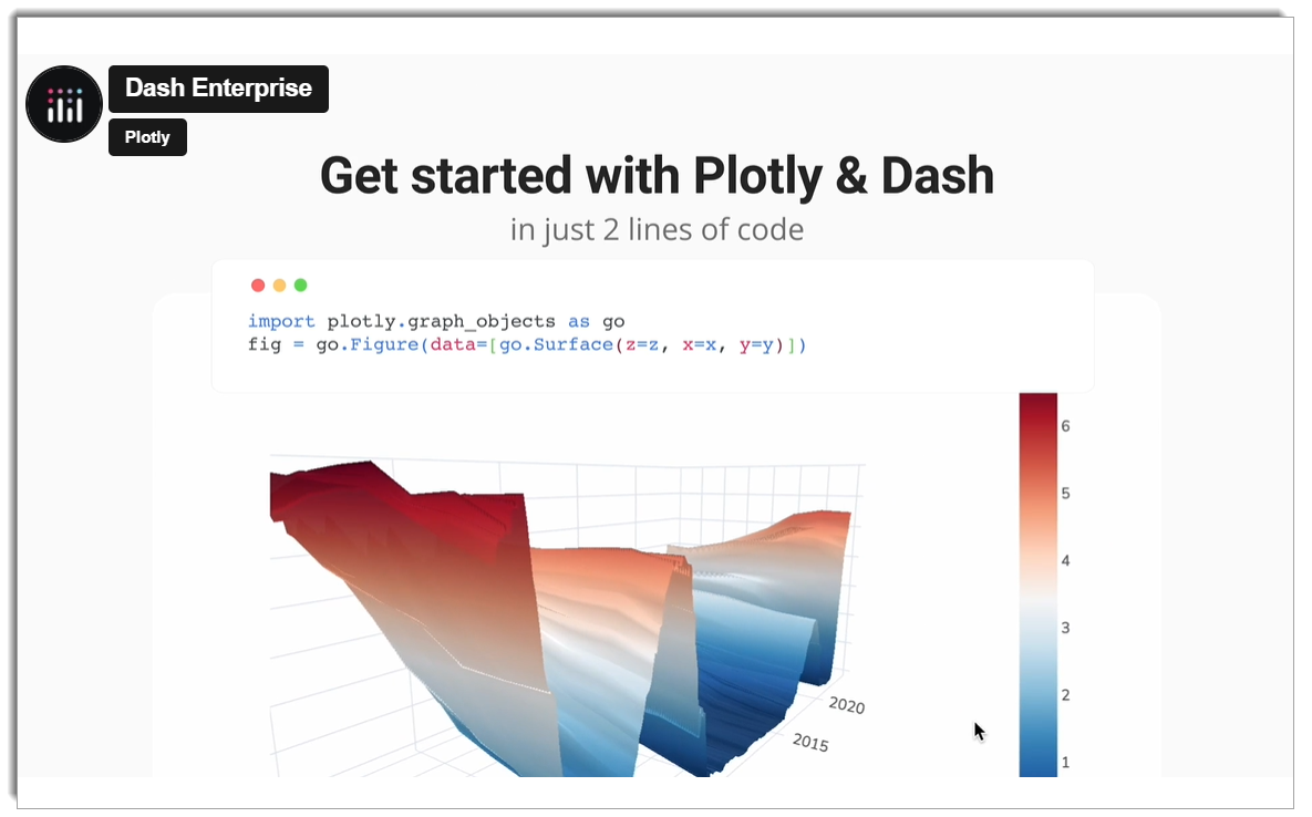
Plotly is used for creating web-based data visualizations. It is compatible with a broad spectrum of chart types, from basic line charts to 3D charts, which makes it suitable for visualizing and analyzing large amounts of data. Plotly is used across various industries, including finance, healthcare, and others, to analyze important metrics and make decisions based on the data.
Key Features:
- Interactive Visualizations: Plotly provides a large number of chart types, such as scatter, bar, histogram, heatmap, and 3D surface charts. All the visualizations are dynamic, and users can zoom in, hover, and click on the data points to get more information. This makes it possible to find trends that may not be easily seen when using static charts.
- Data Integration: Plotly works well with a variety of data sources such as databases, data warehouses, and cloud services. It supports Python, R, MATLAB, and JavaScript, which makes it a suitable tool for data scientists and analysts who operate in different environments.
- Customizable Dashboards: Use multiple charts and controls to develop a single view that will give you a complete picture of the data. Dash, based on Flask, is an excellent tool for creating web applications that can show changes in real-time, which is very useful for tracking live KPIs and metrics.
- Scalability and Collaboration: Plotly Enterprise is a server solution that enables teams to work on data analysis tasks more efficiently. It is possible to share the dashboards and the reports with other users, which means that everyone will be able to work with the same data.
9. Datawrapper
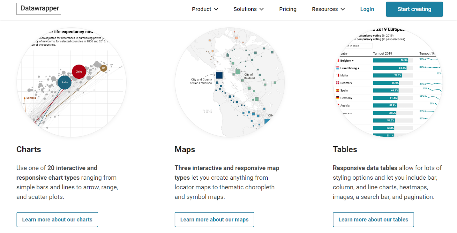
Designed to make data visualization easier, Datawrapper is an online tool that allows users to create engaging and visually appealing charts, maps, and tables from different sources of data. It is a perfect tool for journalists, researchers, and any business people who need to represent data effectively and clearly. Datawrapper is a tool that helps to create simple and engaging graphics from large datasets, which are useful to convey important information.
Key Features:
- Ease of Use: Datawrapper is famous for its simplicity and does not require any coding skills from the user. Data can be imported from CSV files or Google Sheets and converted into dynamic visualizations within a few steps.
- Wide Range of Visualization Options: Datawrapper has many chart types including bar charts, line charts, maps, and scatter plots among others. All these visualizations can be further tweaked to meet your branding and presentation requirements.
- Responsive Design: Every Datawrapper visualization is responsive, meaning it will adapt to any screen size, be it a computer monitor or a mobile phone. This makes sharing and embedding visualizations on websites and social media easier and more efficient.
- Real-time Data Integration: Datawrapper allows for real-time data connection, so your visualizations will update as soon as new data is added. This feature is most beneficial for live data dashboards and news outlets that require the most recent data to be shown.
- Security and Collaboration: Datawrapper has strong security measures in place to safeguard your data and the visualizations you create. It also enables the sharing of files and documents within a team, and the ability to work on them concurrently within your organization.
10. TIBCO Spotfire
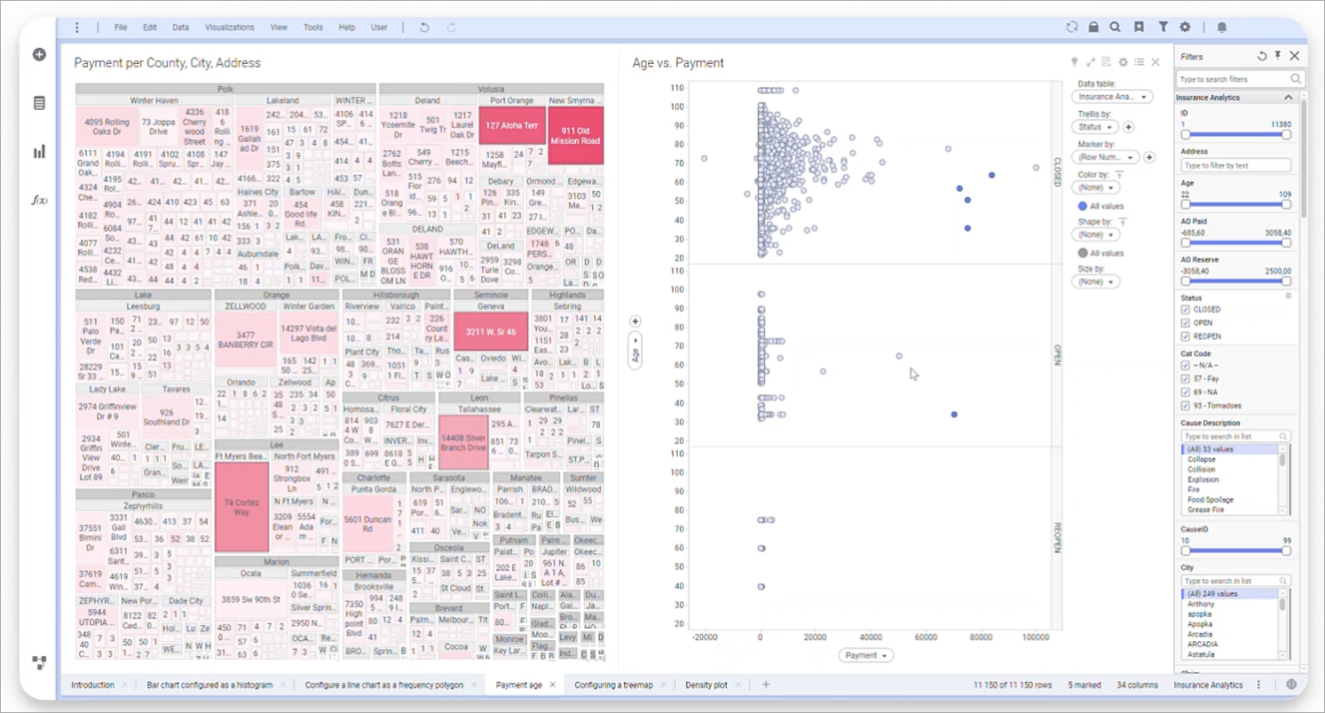
TIBCO Spotfire is a powerful tool for analytics and business intelligence created by TIBCO Software that can turn complex data into visually appealing and engaging information. It stands out for its data visualization and complex analysis, which enable the understanding of KPIs and support decision-making and planning.
Key Features:
- Data Connectivity: TIBCO Spotfire provides many ways to import data from different sources such as relational databases, cloud services, and big data solutions. This versatility makes it possible to integrate and collect data from various sources without much of a hitch.
- User Friendly: TIBCO Spotfire is designed for both, power users and beginners, as it has a user-friendly interface and a large number of features. It covers everything from simple data discovery to complex analysis, thus making it easy to use for the user.
- Data Transformation with Data Wrangling: TIBCO Spotfire also has robust data preparation tools, which means that the ETL process of extracting, transforming, and loading can be done within the application. The platform also allows easy data cleaning, transformation, and blending, which makes it easier for the users to prepare data for analysis.
- Automated Data Refresh: In Spotfire, data can be refreshed automatically based on a certain schedule, thus, there is no need to update the report manually. It is possible to schedule automatic refreshes of the data to ensure that the dashboards and reports are updated regularly, which will save time and prevent the use of outdated information.
11. SAP Lumira
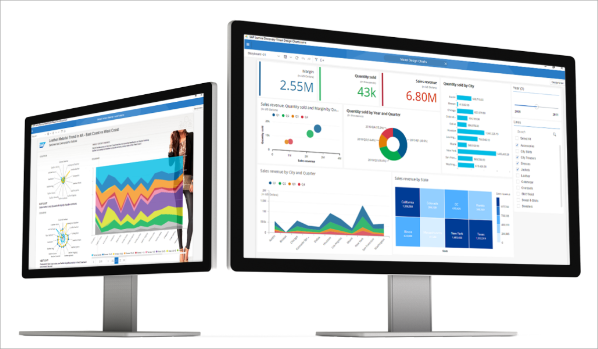
SAP Lumira is a data visualization tool that is developed by SAP that enables users to convert different data feeds into meaningful and engaging visual formats. It offers powerful data modeling features and various types of charts and dashboards, ranging from simple to complex. SAP Lumira assists you in understanding the key performance indicators (KPIs) and business measures to enable better decision-making and planning.
Key Features:
- Data Connectivity: SAP Lumira has numerous features that allow users to connect to various data sources such as SAP HANA, Excel spreadsheets, SQL databases, and cloud data services. This makes data integration from different sources very smooth.
- User Friendly: SAP Lumira has a simple and intuitive interface that can be used by both beginners and experienced analysts, and it has a wide range of features, from basic data visualization to sophisticated analysis.
- Data Transformation with Data Wrangling: SAP Lumira has a powerful data preparation tool for ETL (Extract, Transform, Load) processes. It is easy to use as it enables users to load data from different sources and carry out operations like selection, sorting, and summarization. Other features include pivoting and text manipulation, which are considered advanced transformations.
- Automated Data Refresh: SAP Lumira also has the capability of automating data refreshes to avoid the manual process of updating. The data can be refreshed at certain time intervals, which means that the data in the dashboards and reports is always up-to-date. This feature assists in ensuring that the data is always up to date and accurate without the need for any input from the user.
12. Grafana
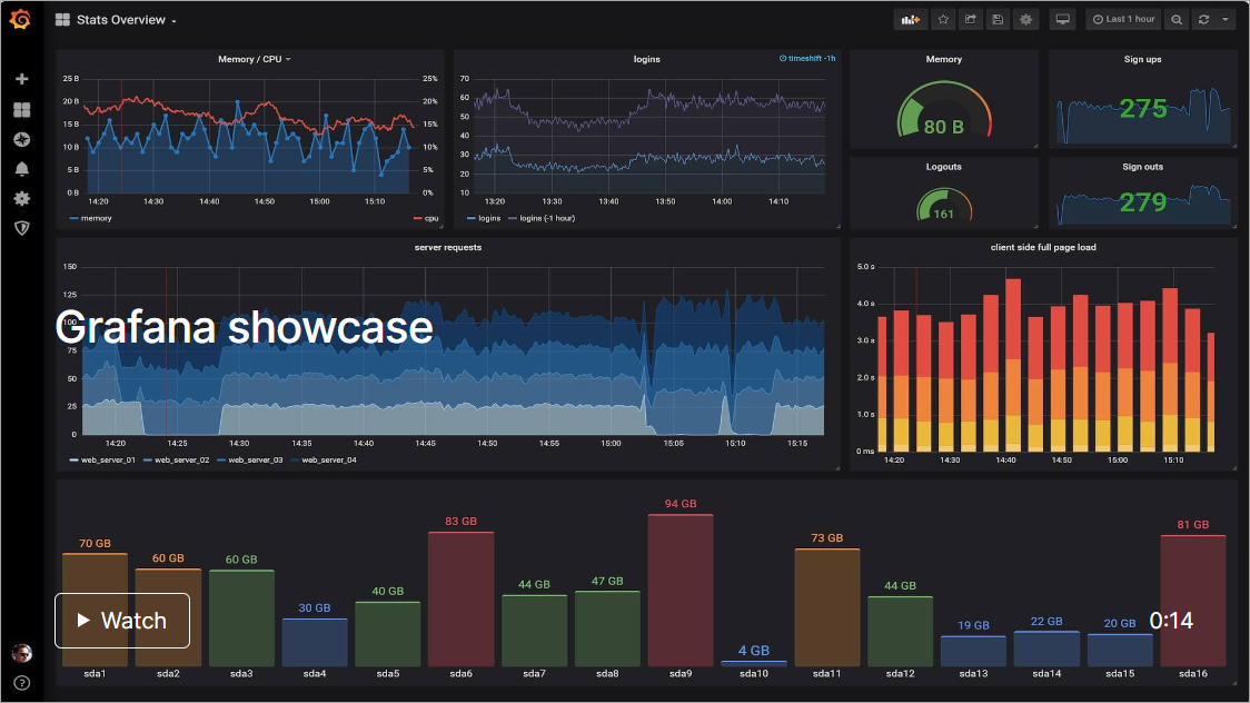
Grafana is a monitoring and observability platform that is developed as an open-source tool. It allows you to design, analyze, and collaborate on dashboards with your team, all in one place and visually integrated way. Grafana is a versatile tool for data analysis and visualization since it allows for monitoring metrics, logs, and traces.
Key Features:
- Data Connectivity: Grafana supports a variety of data sources such as Prometheus, Elasticsearch, InfluxDB, MySQL, and many others. This flexibility enables you to pull data from various systems into a single dashboard for analysis.
- User-Friendly Interface: The graphical user interface of Grafana is quite simple and easy to use for both new and experienced users. It has a drag-and-drop dashboard editor, which makes it possible to design and develop dashboards without the need for a lot of technical skills.
- Powerful Query Editor: Grafana has a very powerful query editor that lets you type in the query you want to apply to the data. No matter if you are using SQL, PromQL, or any other query language, Grafana has all the necessary features to analyze your data.
- Alerts and Notifications: Alerting in Grafana allows you to create notifications based on conditions in the data you are monitoring. Notifications can be delivered via email, Slack, or any other means, so you receive timely updates on key figures.
- Plugins and Extensibility: The plugin system of Grafana allows you to expand the functionality of the application with more panels, data sources, and applications. Grafana has a large and active community, and enterprise teams that develop plugins that extend the platform’s functionality.
13. Apache Superset
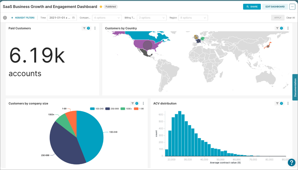
Apache Superset is a data visualization and business intelligence tool, designed to turn large amounts of data from multiple sources into easily understandable dashboards and reports. This is due to its flexibility and the fact that it can handle large amounts of data, which makes it suitable for both data analysts and business users. Superset has a rich set of built-in visualizations, ranging from simple charts to complex multi-dimensional visualizations. It assists users in getting a broad understanding of KPIs and metrics to facilitate decision-making and planning.
Key Features:
- Data Connectivity: Apache Superset offers a wide range of choices for data connection, ranging from relational databases to big data and cloud services. It supports SQL databases such as MySQL, PostgreSQL, SQLite, and other sources through custom integrations.
- User-Friendly Interface: Superset has a simple and user-friendly interface that can be used by those who are not very familiar with data analysis tools, and at the same time, it is suitable for data scientists and analysts. It has a simple interface that allows users to drag and drop items and create dashboards, which are easy to use for anyone, including those with little or no coding experience.
- Advanced Data Visualization: Superset supports a variety of visualization types including bar charts, line charts, heat maps, and geospatial maps. It can produce clear and informative graphical representations of the data that has been input.
- Extensive Customization: The tool offers a high level of flexibility in terms of the appearance and functionality of the visualizations and dashboards, which can be adjusted to fit particular requirements. This includes the possibility to apply filters, queries, and other features that can be changed during the work with the table.
- Security and Authentication: Superset has strong security measures, including role-based access control (RBAC) and support for OAuth and LDAP. These features make it possible to protect data and allow only authorized users to access the information.
14. D3.js
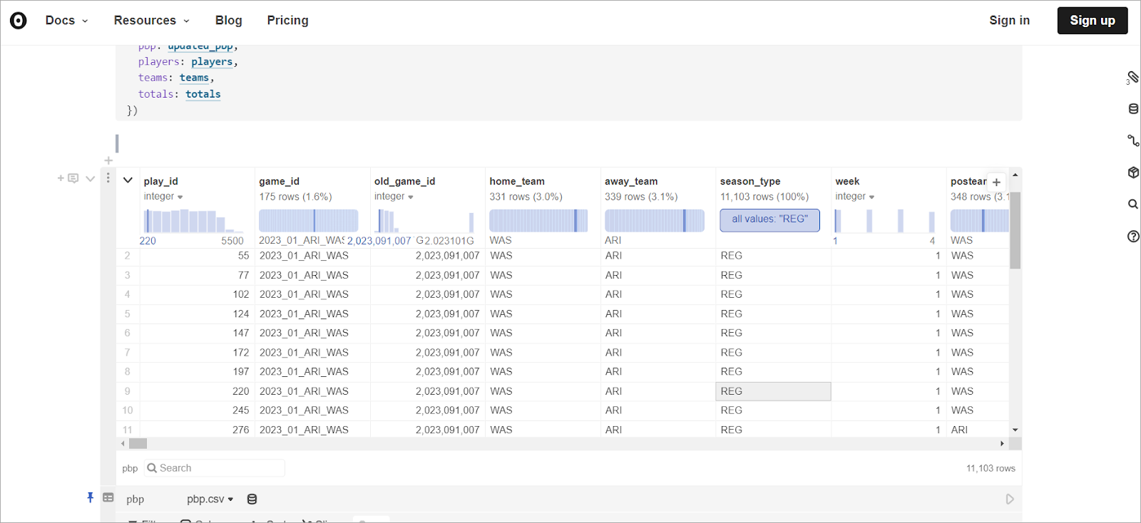
Created by Mike Bostock, D3.js (Data-Driven Documents) is an open-source library that is written in JavaScript and enables the creation of data visualizations in web browsers. Due to its feature of associating any data with the Document Object Model (DOM), D3.js makes data come alive through the use of HTML, SVG, and CSS. This tool is very versatile and allows for a lot of fine-tuning of the final look and feel of the data visualization, which is why it is popular among data visualization aficionados and practitioners.
Key Features:
- Data Binding: D3.js is particularly good at associating data with DOM elements, which allows for the creation of intricate visualizations that adapt to changes in the data. This feature is useful for real time data and interaction with the data.
- Highly Customizable: With D3.js, you have full control over the look and functionality of your visualizations. It also offers a broad variety of shapes, colors, transitions, and animations, which enable specific and complex graphics.
- Data Transformation and Manipulation: D3.js also has rich functions for data conversion and processing. It enables you to select, organize, and analyze data in a way that makes it possible to create specific visualizations that represent the data in the best way possible.
- Interactivity: One of D3.js’s strengths is that it can generate animations. Event listeners and transitions are ways of making charts and graphs more interactive and, thus, more useful to the user.
How you can choose the right bid data visualization tool?
Selecting the right big data visualization tool is very important to turn raw data into information. Here are some key considerations to guide your decision:
1. Understand Your Data Needs
- Data Sources: Determine which data sources are required to integrate. Ensure the tool can be integrated with your databases, APIs, or file formats.
- Data Volume: Think about how much data you have. Some tools are designed to work with big data sets, and some are designed to work with small data sets.
2. Evaluate User Skill Level
- Technical Expertise: Determine the level of technical competence of your team. Tools like D3.js require coding skills, while others like Power BI are more interactive and can be used by anyone with no coding skills.
- Training and Support: Make sure the tool provides sufficient training materials, guides, and support for your team to learn how to use it effectively.
3. Analyze Visualization Capabilities
- Customization: The first thing that one needs to decide is the level of customization required. Tools like D3. Some js offer more flexibility in terms of customization, while others are more rigid in their design templates.
- Types of Visualizations: Make sure that the tool you choose allows for the types of graphs and charts you need, including bar graphs, scatter plots, heat maps, and other complex graphics.
4. Interactivity and User Experience
- Interactive Features: Search for the tools that enable interactivity like hover effects, zooming, and filtering to make the user engaged.
- Ease of Use: Assess the usability of the tool and the overall experience of the user. An interface that is easy to use will help in cut down on the time spent learning and increase efficiency.
5. Performance and Scalability
- Speed: It is also important to consider the tool’s efficiency when it comes to processing big data. Apache Kafka is one of the tools that are used for real-time data processing.
- Scalability: Make sure that the tool can grow with your increasing data demands. This is important for ensuring that the investment is protected in the future.
6. Cost
- Pricing Models: The pricing models of the two companies should also be compared. Some of the tools are free and can be accessed through open source, while others are paid for or may call for a huge amount of money to be paid at first.
- Total Cost of Ownership: Other factors to consider include the cost of training, the cost of maintenance, and the possibility of having to build more structures.
7. Integration
- Existing Systems: Make sure that the tool is compatible with your current technology infrastructure, such as databases, data warehouses, and other applications.
- Platform Compatibility: Determine whether the tool is compatible with the operating systems and platforms used in your organization.
8. Security
- Data Security: Assess the tool’s data protection measures, including encryption, access controls, and adherence to industry best practices.
- Regulatory Compliance: Make sure the tool complies with any legal standards that apply to your sector, for example, the GDPR in terms of data protection.
How can Airbyte Help You Enhance Big Data Visualization?
Using the above-listed big data visualization tools, you can efficiently draw data-driven insights and make faster organizational decisions. However, you need to unify your data and streamline information to harness the power of data. Airbyte is a reliable platform that effortlessly manages large datasets if you want to create robust data integration with automated data pipelines to consolidate the data.
With its extensive portfolio of over 550+ pre-built connectors, Airbyte can help you streamline data extraction and replication by facilitating data transfer between multiple sources and destinations. Airbyte can also assist you in seamlessly building custom connectors through its no-code Connector Development Kit. Using its user-friendly interface and no-code methodology, you can extract and organize structured and unstructured data from different sources.
Once you have created a single source of truth, you can connect your big data visualization tools to analyze data and quickly make informed decisions.
Here are some of the key features of Airbyte:
- Data Pipeline Flexibility: It offers a variety of flexible options for building and managing data pipelines. You can utilize a user-friendly interface for easy setup, an API for programmatic access, the Terraform Provider for infrastructure as code deployments, or PyAirbyte for integration within Python applications.
- AI Assistant: The Airbyte AI Assistant in Connector Builder is a powerful tool that simplifies the process of building data connectors. This AI assistant automatically pre-fills and configures various fields, significantly reducing the development time required to set up new connectors.
- Sync Modes: Airbyte has multiple sync modes to fit your use case. Based on your data sync needs, you can choose between Full Refresh (Overwrite or Append) and Incremental Sync (Append) options.
- Vector Database Support: Airbyte provides robust support for various vector database destinations, such as Pinecone, Milvus, Qdrant, and Weaviate. This capability empowers you to effectively store and query high-dimensional vector data, which is essential for enhancing AI applications.
- Orchestration: It enables you to orchestrate data pipelines with popular tools like Airflow, Dagster, Prefect, and Kestra. This integration facilitates the management of complex workflows and enhances the efficiency of your data processes.
- Multi-Tenancy: Airbyte's Self-Managed Enterprise enables your organization to efficiently manage multiple users, teams, or departments within a single deployment. Each tenant operates independently, ensuring data isolation and security while sharing the same infrastructure.
Final Word
As data expands in size and complexity, big data visualization tools will become more imperative than ever. These tools provide a comprehensive and updated set of features to represent a large volume of complex data in a clean and interactive visual. This article covers some of the best visualization tools for big data that you can utilize to perform big data analytics and transition your business ideas into successful projects.
We recommend using Airbyte to simplify your big data visualization process and increase your business productivity. Sign up for Airbyte today to leverage its data integration capabilities for reliable and adaptable data visualization.
FAQ
What is a big data visualization tool?
A big data visualization tool is a software application that assists users in analyzing and interpreting big data through the use of graphical interfaces such as charts, graphs, and maps. These tools help in finding patterns, trends, and information in large datasets in a short period of time.
What is the best visualization tool for large datasets?
The best visualization tool for large datasets depends on the requirements, but the most popular tools are Tableau, Power BI, and D3.js. Tableau has easy-to-use and engaging dashboards; Power BI has strong data connection and visualization capabilities; D3.js offers unmatched flexibility for intricate visualizations.
What should you do next?
Hope you enjoyed the reading. Here are the 3 ways we can help you in your data journey:


